Branding a teen comedy-slasher-horror has its challenges — we needed to convey gory and cultural tones in a humorous way. Our answer?
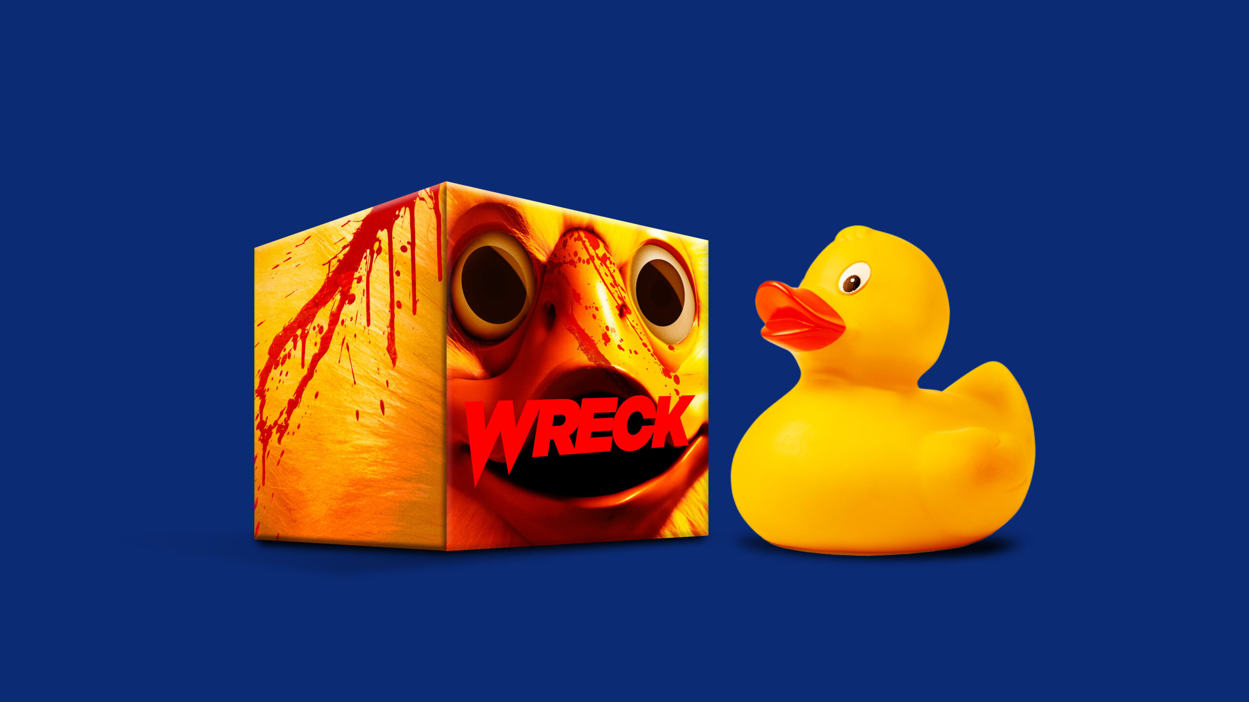
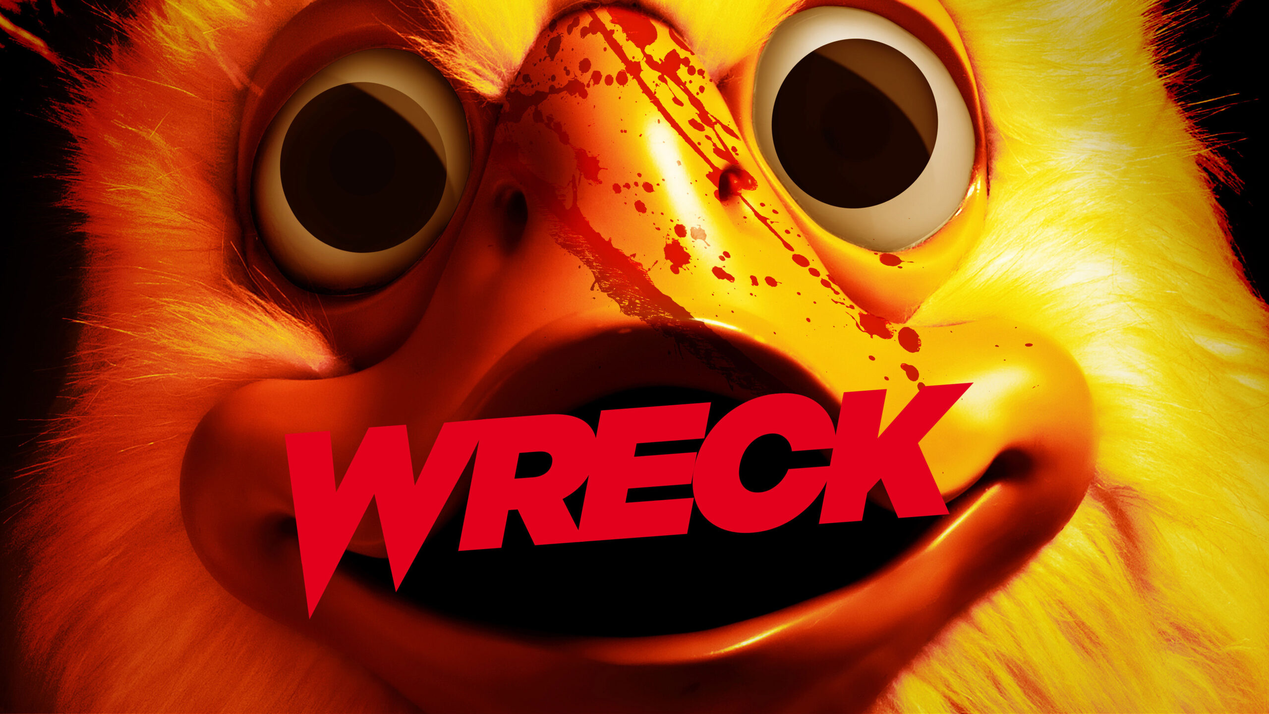
Focus on the bloody duck.
-
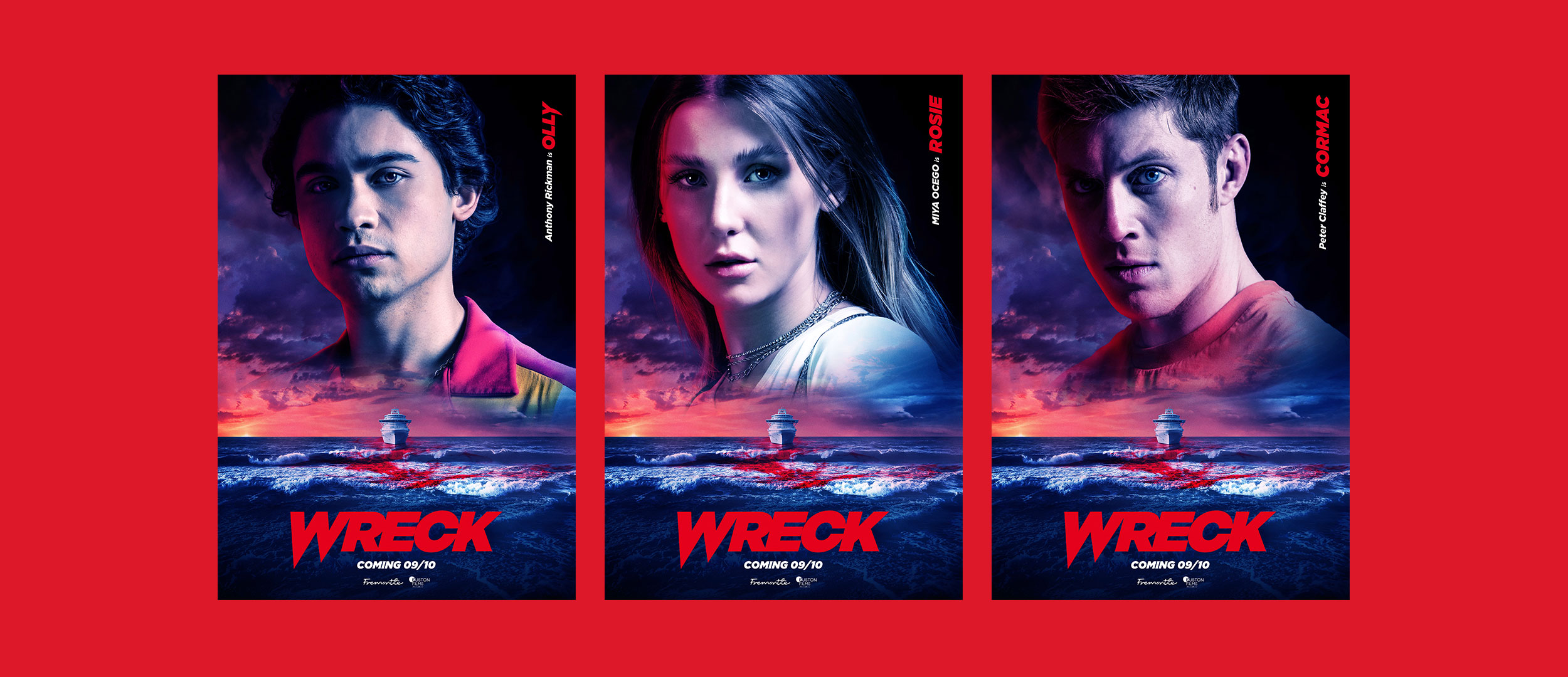
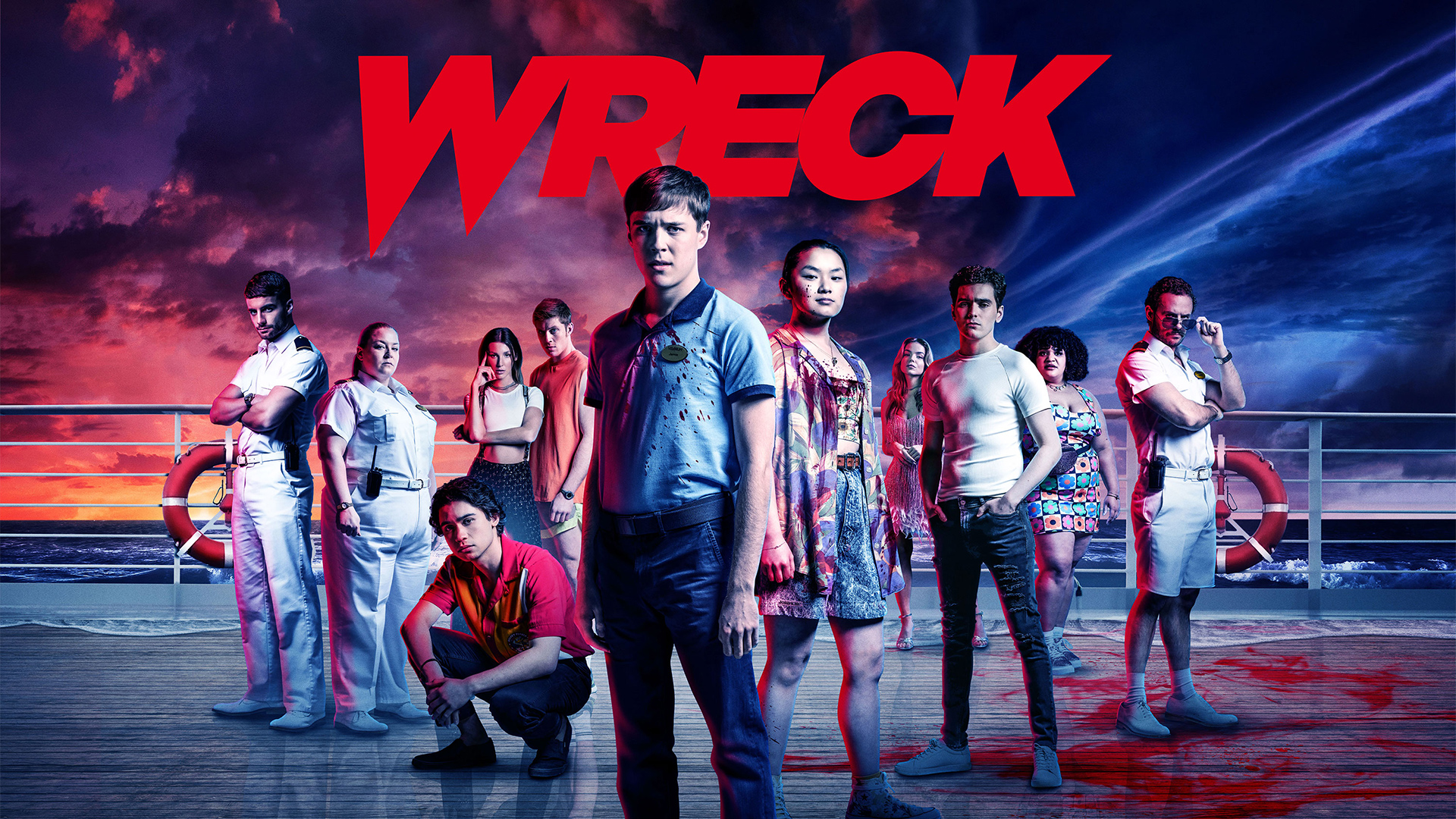
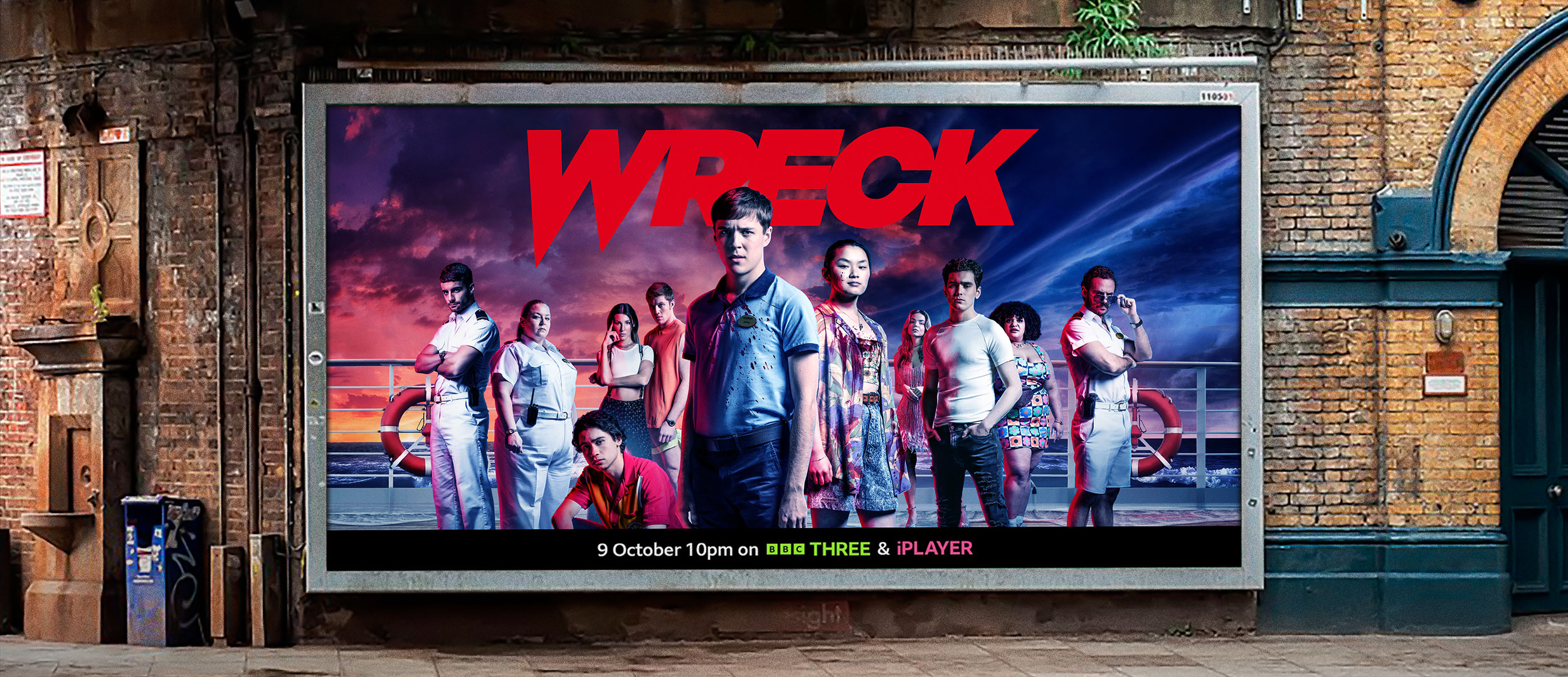
In search of his missing sister, 19-year-old lost boy Jamie joins the lowly workers on an opulent mega-liner. Things take a turn and as Jamie and his motley crew hunt for the truth, they begin to realise that they are the ones being hunted. And for blood sport…
-
Nodding to the golden era of slashers, this show combines big laughs, contemporary themes and splashes of gore. For us, the tone was paramount. Our challenge was to balance the humour with the sinister in a way that’s both appealing and visually impactful.
We needed to create visuals that truly represented the show but could also be used in an effective digital campaign.

-
Our approach was to deliver a series of concepts positioned firmly within the Dark Comedy and Horror brackets, whilst highlighting the cultural themes and the show’s charismatic characters.
By expanding the duck as the key visual, we delivered a key art that has humour, impact, and tides of sheer bloody terror.
-
Creating a title that attracts the right kind of fan can be a challenge. Oink worked with the filmmakers to create a logo that was inspired by teen slasher classics but took on an identity of its own.
We wanted it to feel edgy, modern and sharp… Sharper than a knife.


-
As with any branding project, you need to focus on what sets the product apart from the norm… and what’s more unique than a fluffy, killer duck on a rampage? At first, the film-makers were apprehensive about revealing the villain to their teen horror audience too soon. But our suggestion was not to shy away from it, but to own it. We created two teaser artworks that reveal the killer duck in its blood-soaked glory and leave the audience wanting more.
-
We created a visually striking campaign that was executed with consistently across all platforms. With a custom Wreck logo lockup and that duck as a theme, Oink delivered all the practical elements that make for a successful campaign in one terrifying on-brand package.
Wreck went live on BBC Three and BBC iPlayer in October 2022.