-
How do you combine the branding of England’s oldest medical college with biophillic design, the human body, and the geography of Liverpool? Distill these ideas into a concept we’re all familiar with: The Spine.
-
Founded by Henry VIII in 1518, the Royal College of Physicians (RCP) is the oldest medical college in England. In 2021, they came to us to brand their new building in Liverpool — it was RCP’s first expansion out of London and they wanted to be woven into the fabric of their new city.
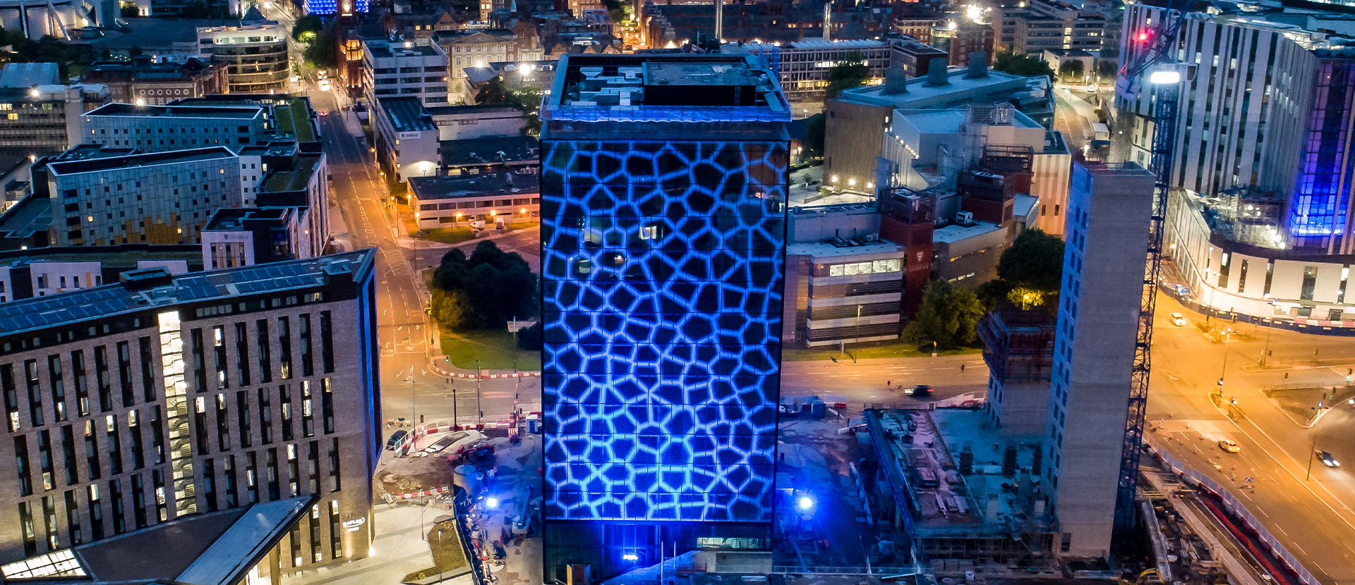
With RCP expanding to two homes for the first time in their 500-year history, our task was to create an experience that aligned with their health values while distinguishing themselves from competitors in Liverpool. The venue was to be RCP’s flagship destination for conferences in Liverpool, hosted inside an impressive state-of-the-art glass structure.

-
We challenged RCP that their new events space could be more than just a beacon of excellence — it could be positioned as a space that brings Liverpool’s communities together in a health-conscious way.
Our brand aimed to unify the diverse communities of Liverpool while upholding the health-focused values of RCP. We sought to develop an identity that would complement the existing RCP ecosystem yet stand out in a meaningful way. Most importantly, our brand needed to authentically capture the spirit of this landmark building and all that it represents to the people of Liverpool. By bringing together stakeholders from across the city, we created a brand that harmonises with the past while envisioning a healthy future.


-
The building, health, and the regions of Liverpool was fertile ground for visual inspiration, but what name brings all these elements together? Being a prestigious medical college, it needed an anatomical touch.
The spine is the catalyst of health and communication across the human body. The space was intended to be the destination for connection and wellbeing. ‘Spaces at The Spine’ was a perfect fit.

-
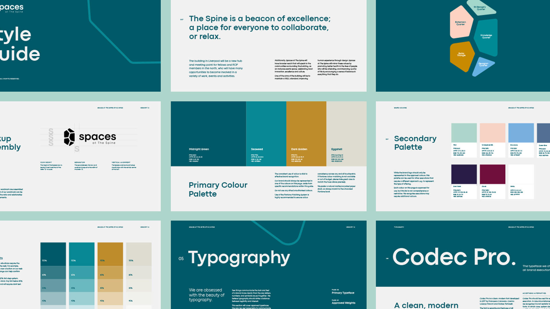
We created a recognisable icon that represented the various districts of Liverpool, the human body, and nature, positioning The Spine as a destination that unites communities through health and sustainability.
-
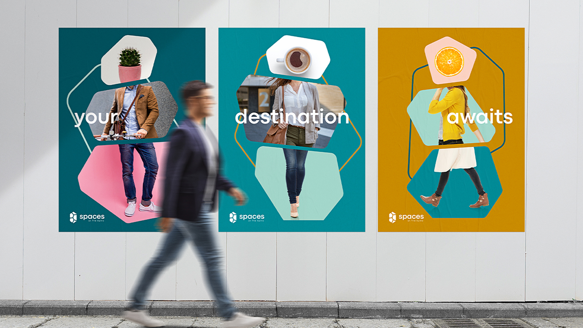
The final concept highlights The Spine’s dedication to promoting good mental health and improving quality of life by creating a balance between work and play with its juxtaposition of imagery, while resonating with the diverse audiences that engage with the space, from event organisers and commuters, to students and industry professionals.

-
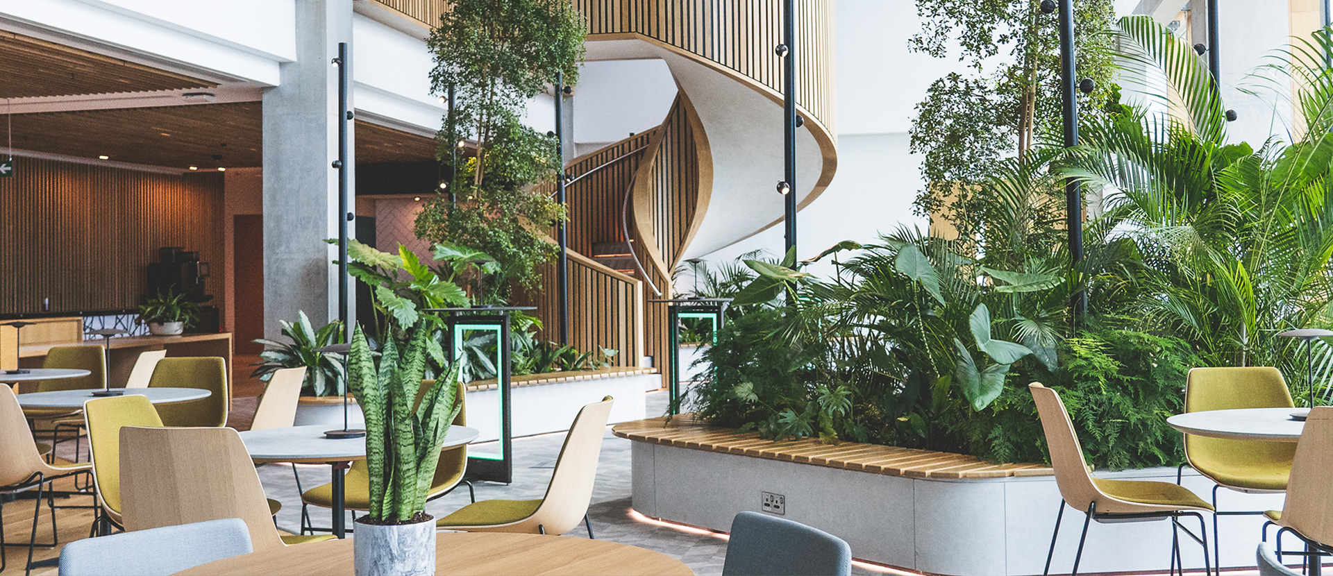
To create a lasting impact at the grand opening, custom illustrations were thoughtfully designed to merge the building’s features with the brand. We reflected the intricate and delicate plant life, capturing the biophilic heart of The Spine and RCP, bringing a sense of sophistication to the brand for launch.
Brand assets we created included signage for their featured spaces including The Base Cafe and The Axis restaurant, which welcomed over 100 attendees for the launch.
-
We created a recognisable icon that represents the various districts of Liverpool, the building’s form, and nature, positioning The Spine as a destination that unites communities through health and sustainability.

-
Working with The Royal College of Physicians was a truly enriching experience — we relished the challenge of shaping a brand that captured the essence of The Spine as well as RCP’s commitment to health and sustainability. This resulted in a sophisticated and elegant brand launch, leaving a lasting impact and fostering a strong connection with our client and their expanded audience.


